We ultimately decided not to make any changes to the user tasks since part 1 because we believed that the current user tasks maintain a good balance between simplicity and functionality. If we decided to add more user tasks, the application could become too cluttered and thus discoverability will suffer but if we decided on removing some user tasks, the application would become too simple and thus utility will decrease.
Lastly, after conducting our preliminary test of our prototype, we recognized some minor fixes we needed to make in order to give the application a smoother user experience. These minor fixes entail creating clear signifiers for going forward and back through the application and making the action of confirming choices in multi-select drop-down menus more clear and evident. We believe that making these changes will improve the overall user experience.
Lastly, after conducting our preliminary test of our prototype, we recognized some minor fixes we needed to make in order to give the application a smoother user experience. These minor fixes entail creating clear signifiers for going forward and back through the application and making the action of confirming choices in multi-select drop-down menus more clear and evident. We believe that making these changes will improve the overall user experience.
Our Wireframe
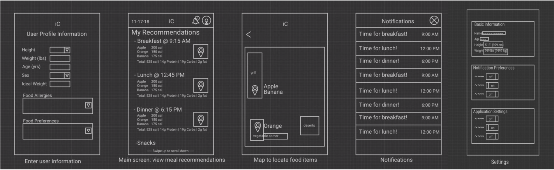
Our team did a good job in the initial paper prototyping as before the task; we omitted some objects that would add clutter to the prototype as well as reduce the discoverability of many of our affordances. This would maintain a good balance between simplicity and functionality. First off, we updated the user profile information page with a drop-down menu for food allergies and preferences. We also added selection boxes within the dropbox to select and deselect preferences or allergies just like tags on youtube or skills on Linkedin. This would solve the problem of selecting and editing your profile information. Another change we made came in the user profile button. Here we added functionality to edit your basic information and toggle preferences. We added toggle switches which can be turned on and off at any time in the user’s settings making quick changes on the go. Finally, we updated the login page with a ‘keep me logged in’ button. The user can now check mark a box and stay logged in to their account. All of these updates look very minor at first glance, but they provide the user with enough flexibility to make the app more user-friendly and not clutter it in the process having adequate white space, which makes concise and clear information available to college students in a hurry.
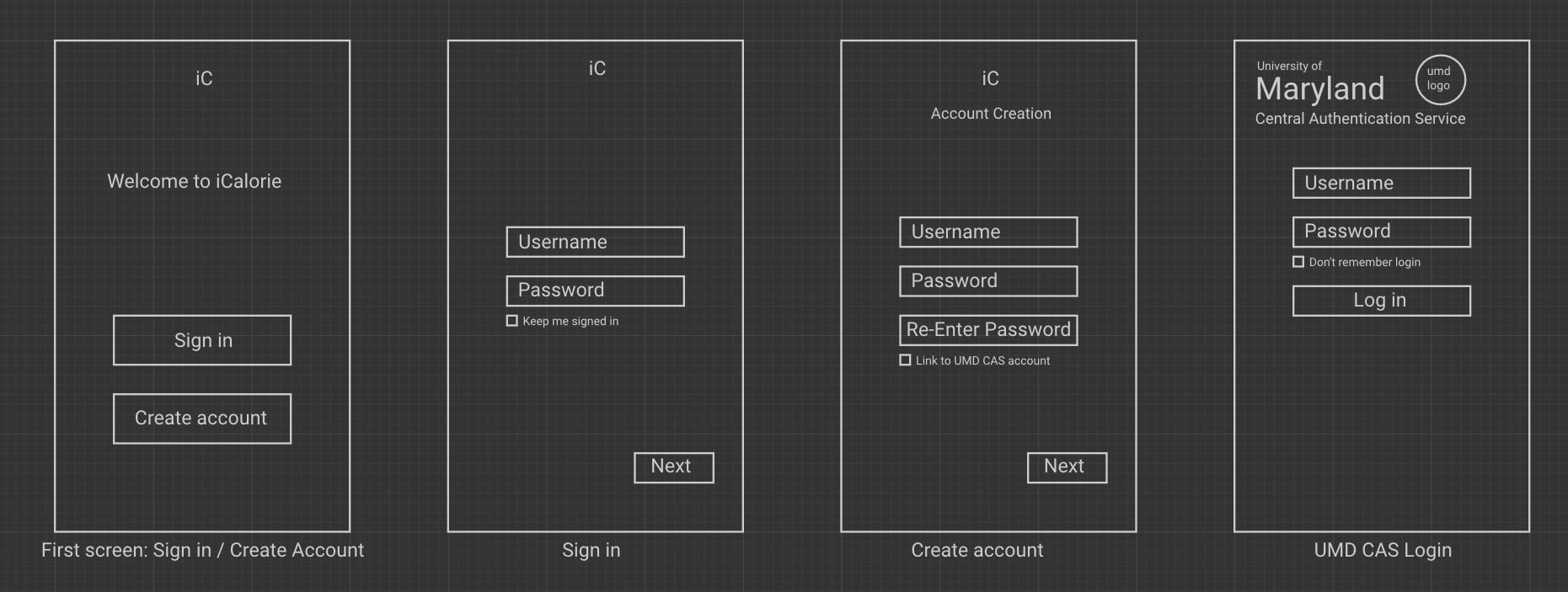
Note: The “sign-in” screen has been modified to include the “keep me signed in” button. We also did our best to replicate the “UMD CAS Login”, for the actual page to login through UMD will be displayed in the application itself. In addition, the “Settings” screen now has toggle switches as mentioned above to the “notification preferences” section
Testing
In our initial testing phase we wanted to present the design without complicating the way in which the user engages with it. We avoided giving context clues to the ways in which the user was to progress through the app and the way in which they were to enter or change information. In doing so we hoped to achieve an organic understanding of how a user would interact with the app after downloading it, either by chance or at the recommendation of a friend.
We discovered multiple things that we hadn’t quite considered during our design phase. Buttons and layouts are easy to conceptualize, but understanding that users will have varying levels of experience in navigating inputs is something we have to keep in mind for the future. Inputs that require multiple pushes or prompts, for instance, need a clear indicator of what should be done to advance to the next phase.
Additionally, not all users are used to navigating apps the same way. Android and iPhone users in particular have different muscle memory when it comes to moving forwards and backwards through screens, as both operating systems use opposing methods (swipe vs menu bar) to traverse app screens. It might be necessary in future operations to have the prototype indicate the method we’re using so as to avoid confusion or increased cognitive load when the user is attempting to use an already unfamiliar design.
Considerations to keep in mind in addition to the above are to keep in mind that users will be able to discover elements or unforeseen flaws that we hadn’t considered in our initial design. Users outside of the design team will be unfamiliar with our concept and thus be approaching the prototype with a different set of eyes than the creators, and as such testing is very important at all stages of prototyping.
